Case study
MyAmaysim responsive website
Amaysim
- Amaysim
- 2014
- UX design
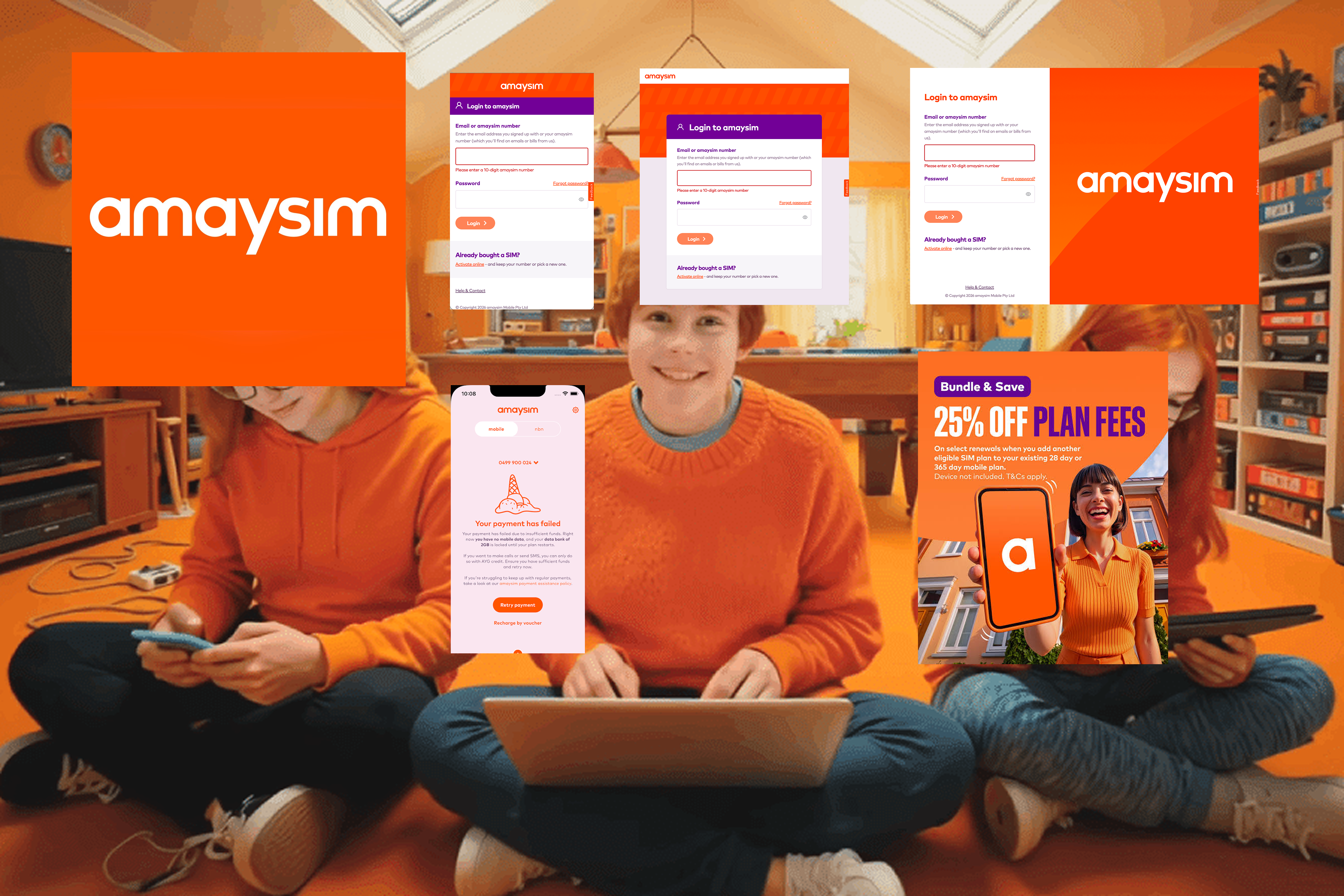
2014 design of MyAmaysim UX member's first fully-responsive portal. Using a mobile-first launch strategy.
My Amaysim: Members Portal Responsive Design
Amaysim · Sydney · 2014
Role: Lead Mobile UX Designer
Platform: Mobile-first responsive web
Overview
Amaysim is one of Australia’s leading low-cost mobile providers, built on simple, no-lock-in plans. My Amaysim is the members portal where customers manage their service: checking usage, recharging, changing plans and updating account details.
The challenge
Amaysim’s customers lived on their phones, but the portal had been designed for desktop. Everyday tasks such as checking remaining data or recharging before running out needed to be quick and effortless on a small screen, where most customers were accessing it.
My role
I led the mobile UX for the redesigned portal, defining the mobile-first approach and designing the key self-service journeys across phone, tablet and desktop.
Approach
- Mobile first. Designed for the smallest screen first, then scaled up, so the most common tasks were always one or two taps away.
- Usage at a glance. Made data, call and text balances the centre of the dashboard, so customers could see where they stood instantly.
- Self-service made simple. Streamlined recharge, plan changes and account management to reduce the need to contact support.
- Responsive across devices. Built consistent layouts for phone, tablet and desktop.

Ready to grow your own business? Let’s talk it through.
Book a call